

Modernizing a brand through red tape and takeovers
Art Direction - Hands on
The Summary
Some rebrands happen all at once. This one didn’t. West Chester Protective Gear needed a modern identity, but the process was gradual, and eventually overtaken by a corporate acquisition. Over several years, I led a careful rollout of refreshed branding across packaging, products, and collateral, while helping transition the brand into what’s now known as PIP Retail Safety.


The Challenge
In 2018, West Chester Protective Gear (WCPG) needed a brand refresh, but with limited time, resources, and visibility, the work had to be incremental. Halfway through that transformation, the company was acquired by Protective Industrial Products (PIP), shifting both priorities and direction. What started as a quick facelift became a multi-year, slow-burn brand evolution through internal and external change.


My Role
As Senior Creative Manager, I owned the creative direction across this transition, from brand updates and packaging to onboarding new product lines and merging brand voices. I worked closely with product managers, marketers, and the executive team to keep design consistent and scalable while adjusting for acquisition demands.
The Approach
We handled the transformation in three major phases:
Phase 1: Modernizing the WCPG Brand
We cleaned up visuals, refreshed packaging, and rolled out an updated look across internal docs and select product lines. This was about building momentum and showing proof of concept.Phase 2: Acquisition Integration
As PIP acquired WCPG, our team collaborated across divisions to ensure visual consistency, merging visual systems and preparing for a full brand transition.Phase 3: Transition to PIP Retail Safety
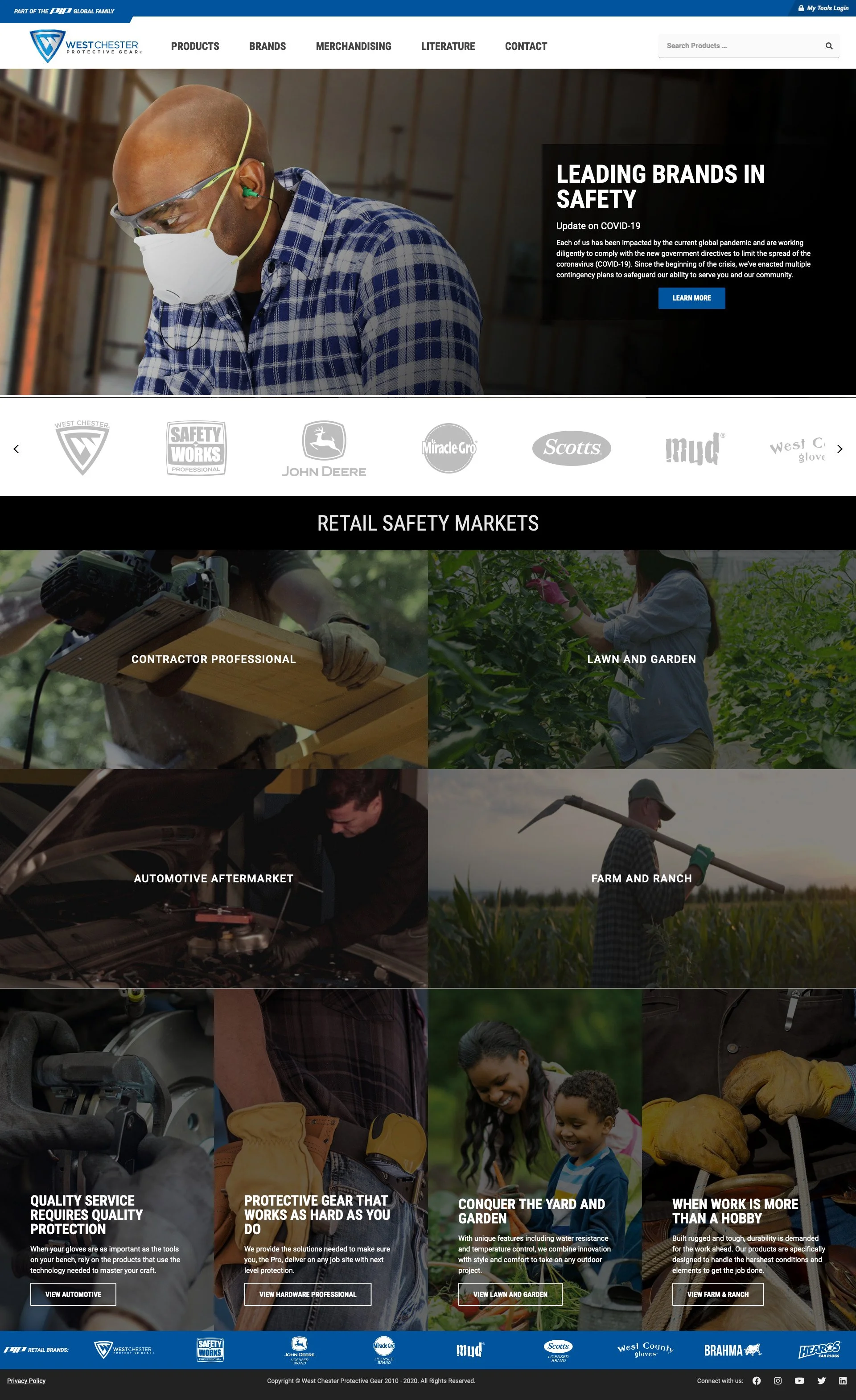
Eventually, the WCPG name disappeared, but its essence lived on in the packaging systems, photography direction, and marketing collateral I helped shape. Today, PIP Retail Safety is the umbrella for many of those original product lines.


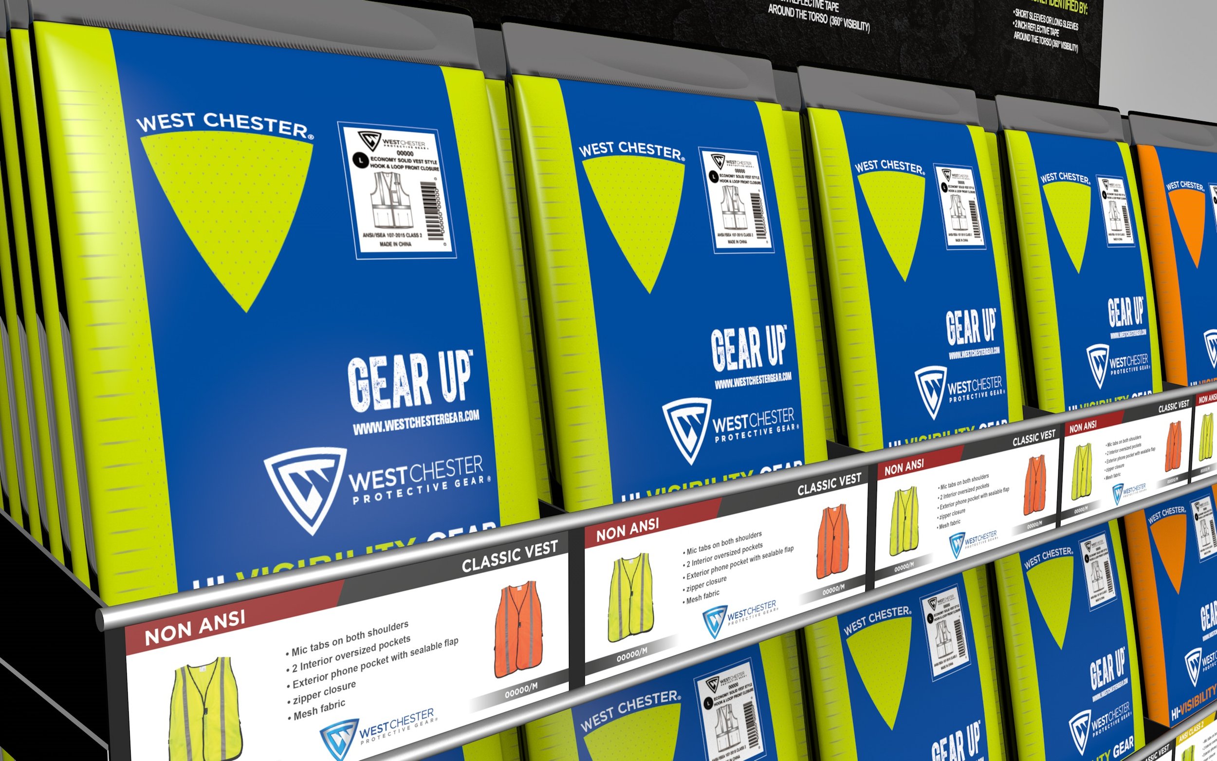
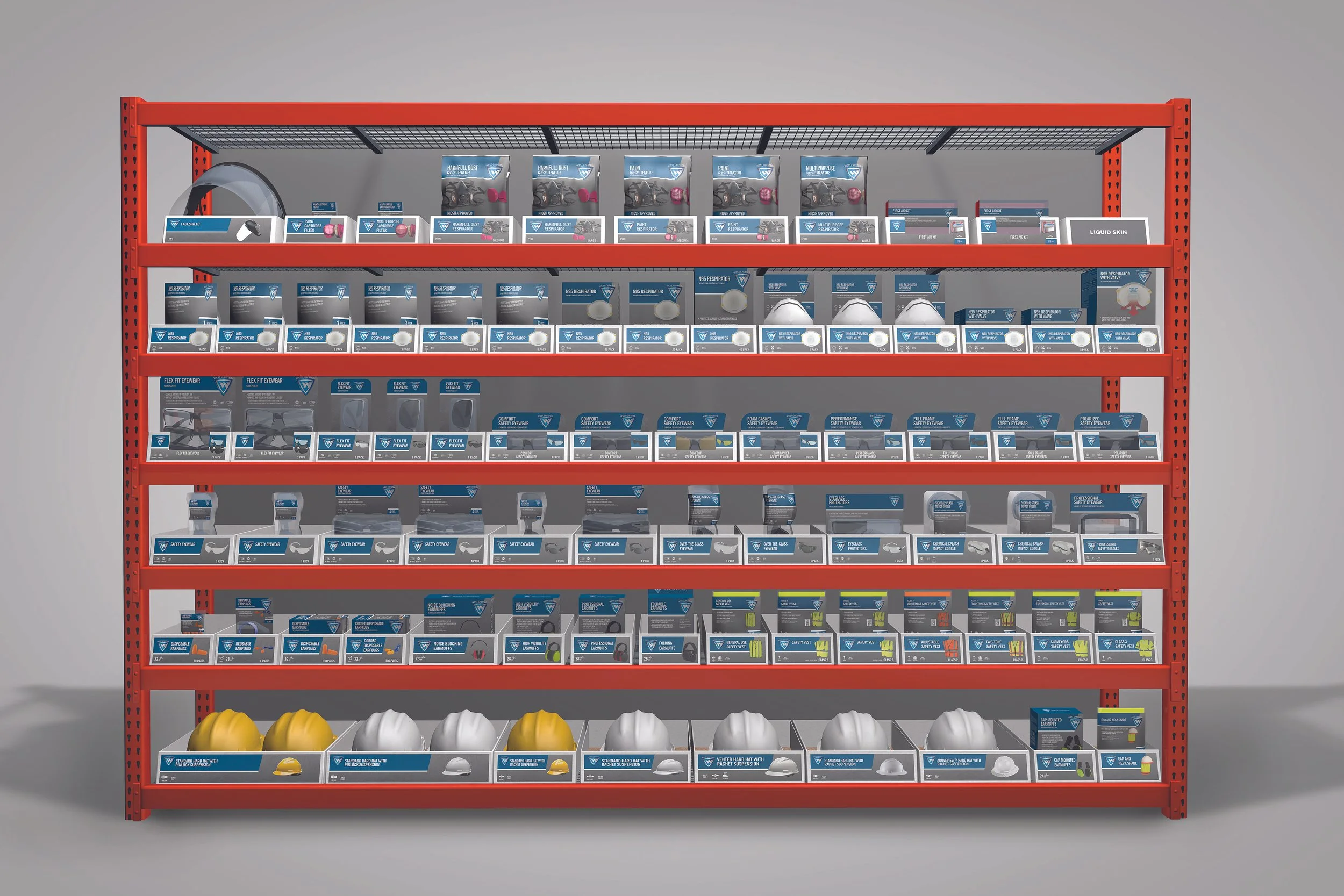
Packaging System Overhaul
I led the design of scalable packaging systems across gloves, rainwear, and other safety gear—focused on clarity, hierarchy, and retail visibility. These systems later served as the foundation for PIP’s private label visual standards.
Brand Identity & Collateral
We modernized the WCPG brand identity subtly, adjusting color palettes, typography, and layout systems, while keeping existing customers familiar with the product lines they knew.
Results
40+ refreshed SKUs across multiple product categories
Visual identity helped bridge WCPG to PIP Retail Safety
Packaging standards adopted by other acquired brands
Supported onboarding and rollout during a major acquisition
MISCELLANEOUS Work on WCPG


Reflection
This project taught me that great design leadership isn’t always about a bold rebrand, it’s about consistency, momentum, and adapting through change. By working in phases and staying close to the evolving business, I helped build a brand system that scaled well beyond its original intent.