
REBRANDING the oldest glove company in America
Creative Direction / Art Direction - Hands on
The Summary
When your brand’s been around since the 1890s, it’s easy to fall behind the times. Boss needed more than just new packaging, they needed a full brand refresh that kept their legacy intact but made them relevant on today's shelves. As Senior Creative Manager, I led the strategic overhaul of everything from brand identity to website to product packaging, and helped reposition Boss as a tough, modern player in industrial gear.
The Challenge
Boss is one of the oldest glove brands in America, with a legacy that stretches back to the 1890s. But in recent years, its branding and packaging had fallen behind, cluttered visuals, inconsistent identity, and a dated retail presence. Boss needed a brand refresh that honored its history while competing on modern shelves.
My Role
As Senior Creative Manager, I led the full creative direction for the rebrand, from initial concept to rollout. This included redesigning packaging across dozens of SKUs, refreshing the brand identity, developing a new website, directing lifestyle photography, and supporting the retail and marketing launch.
The approach
We tackled the rebrand in phases to balance speed with strategy:
Phase 1: Packaging Modernization
A visual overhaul that made key information clear and shelf-ready while keeping gloves the hero.Phase 2: Brand Identity Refresh
Cleaned up the logo, simplified color use, and developed a consistent system across collateral.Phase 3: Digital + Marketing Rollout
Built a new website, updated sell sheets, and rolled out a new art direction for lifestyle imagery.
Design Exploration
We explored multiple directions with varying degrees of heritage and modernity, ultimately landing on a look that balanced boldness with familiarity.
Packaging Transformation
The new packaging focused on clear benefits, glove visibility, and consistency across retail categories. We created a scalable system to support future product lines with ease.
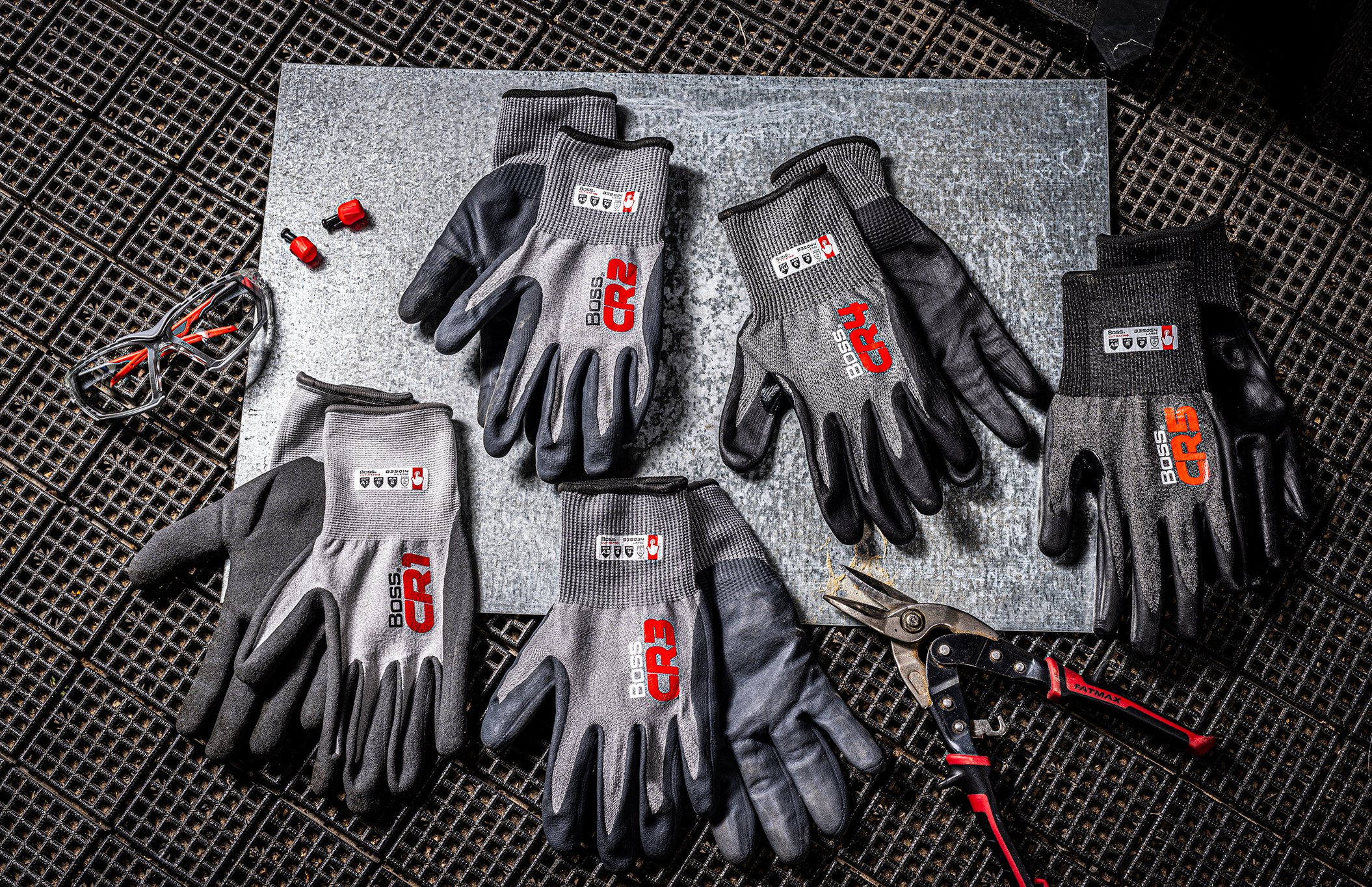
Visual System & Photography
We directed and executed a new photo direction that reflected the rugged, blue-collar identity of the Boss customer, without feeling staged or overly polished.
Results
100+ SKUs refreshed and rolled out to retail
Brand system still in use today, 5+ years later
Elevated Boss’s presence in both B2B and B2C channels
Landed placement in box box stores across the nation
Collateral - Seasonal and breakouts
Reflection
This rebrand wasn’t just about a new look, it was about restoring confidence in a brand that had been forgotten. The phased approach gave us the runway to modernize without alienating legacy customers. It taught me how to navigate change at scale while keeping the user (and the shelf) in focus.